Yepoda
Branding, Packaging, Social Media, Art Direction, Photography
Service used:
The Packed Launch
The Ask
To create a visual world that instils our Korean values and that our mindfully produced skincare products are made with natural and active ingredients.
The Solution
An opportunity to bring a slice of Korea to Europe. It was clear that K-Beauty was becoming more and more popular. So, with Yepoda’s approach to make K-Beauty more accessible, it was our job to show that Korean Skincare is superior to European skincare products. To create a playful, but clear brand architecture for Yepoda’s Korean Skincare Revolution to grow!
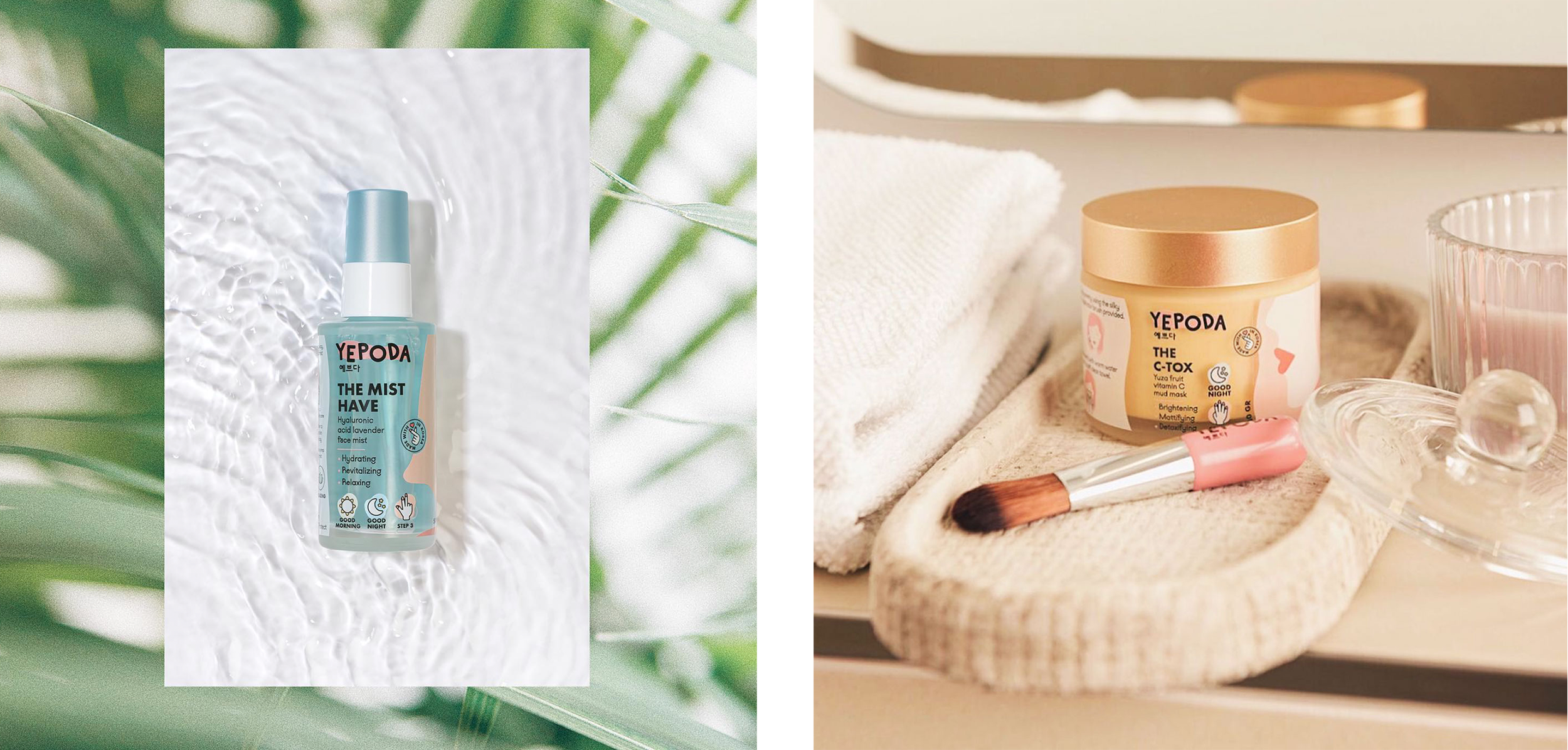
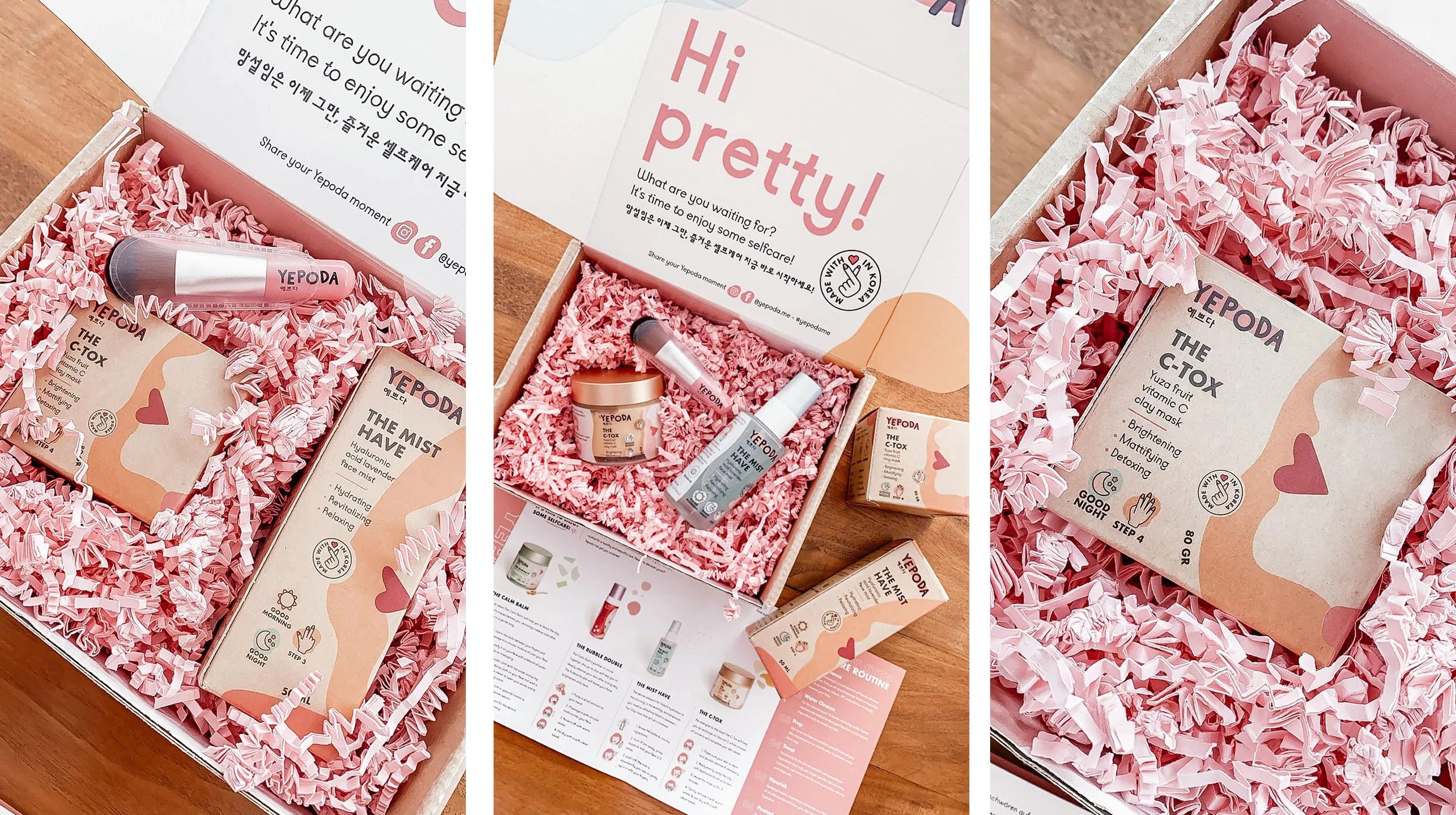
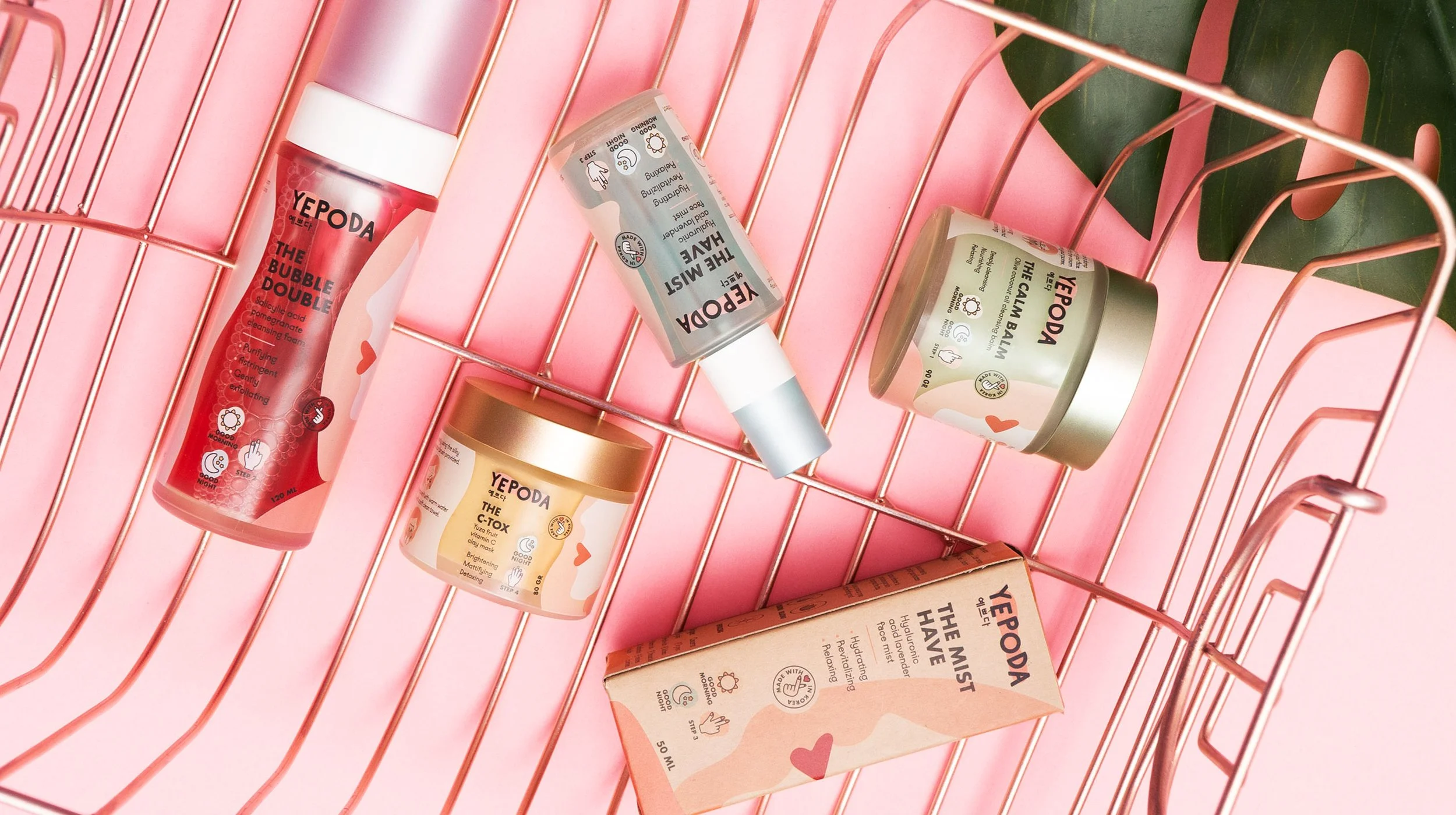
Yepoda means ‘pretty’ in Korean. We wanted the brand name to shine through the graphic style, so we created a set of abstract illustrated girls that represent each skincare range, portraying that ‘pretty’ comes in all shapes and sizes.
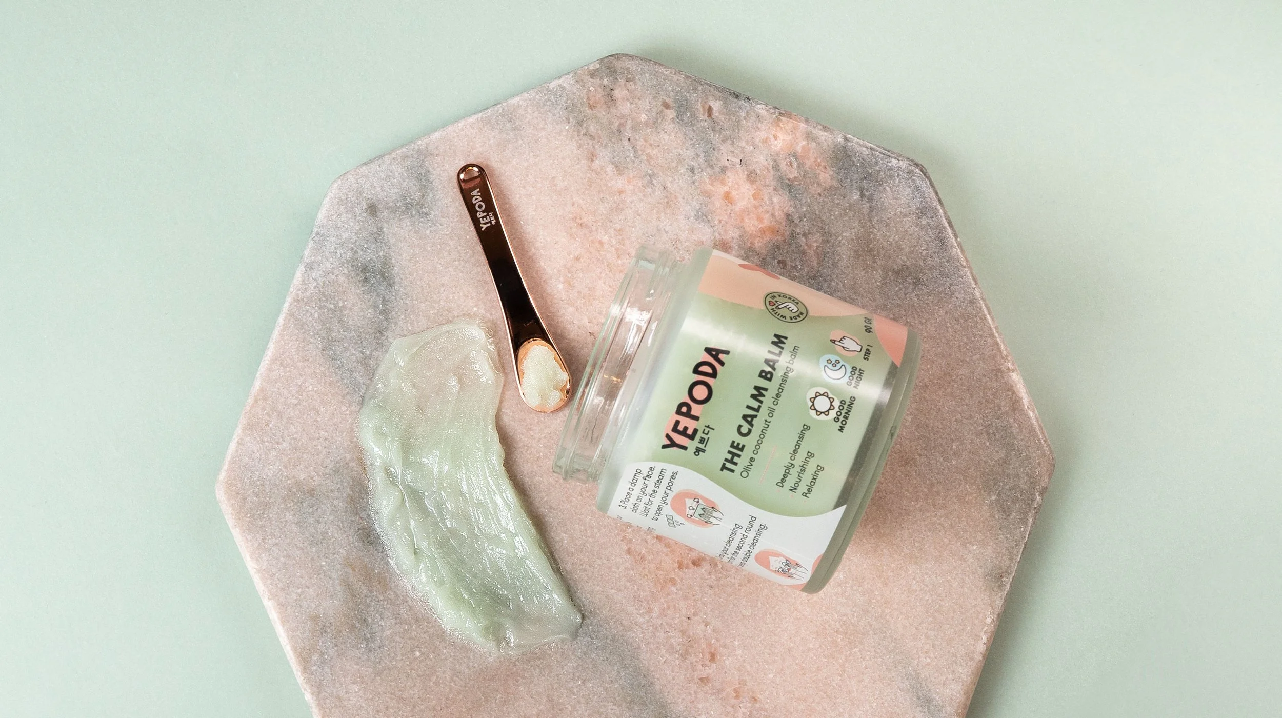
Yepoda have committed themselves to produce all of their products as mindfully as possible. Their products are completely vegan, free of animal-testing and packed in sustainable glass jars. This was important to portray through the visual world, whilst still feeling fun, but clean.

As close as you can virtually get to an in-store retail experience! In the Packed Launch package we offer an unboxing experience phase, including a mailer box, leaflet, sticker sheets and all sorts of extra goodies. Everything you would need to package your brand up into a nifty parcel and post your brand to your customers.